


Google Material for Enterprise
Role: Creative Lead
Overview
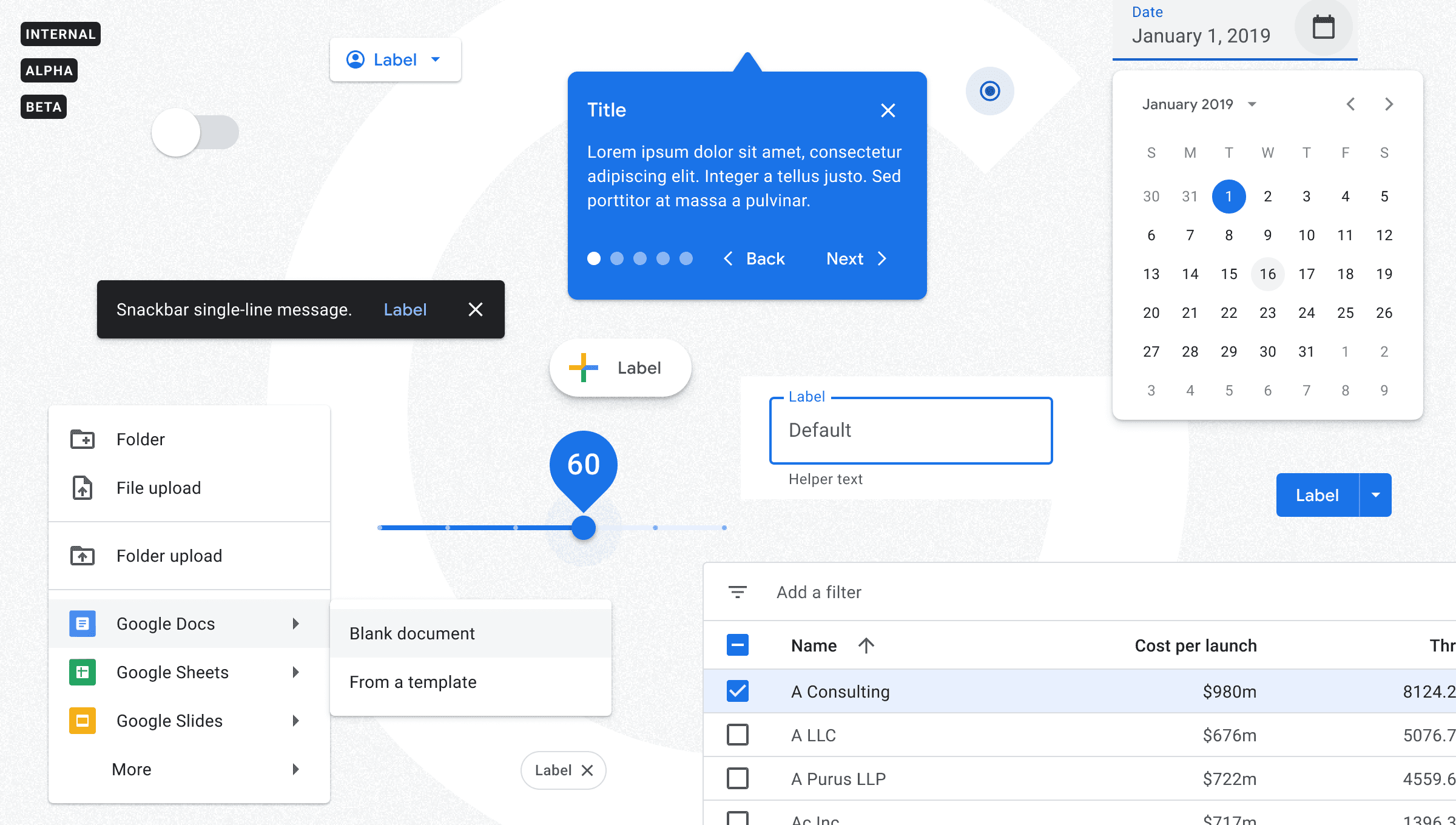
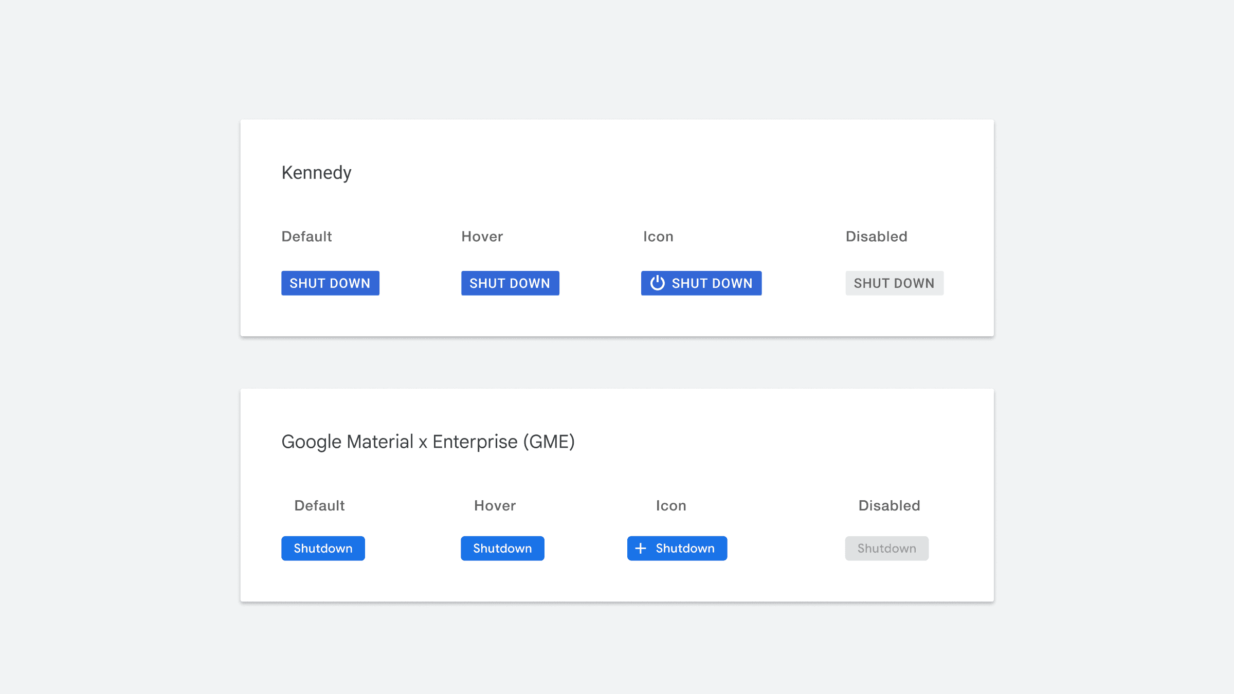
Material Design, the most popular design system in the world, was first developed for creating Android apps. The goal was to have a design system that was intuitive to use and uniform across every device. Google eventually used Material design to rebuild all of its apps to make them more user-friendly and intuitive. The first version of Material used at Google was called Kennedy.
However, Google soon realized that users couldn't distinguish Google-branded apps from others (e.g., Gmail looked the same as Outlook). Google Material was created as a Google branded Material design theme that enables teams to build beautiful, usable products that are distinguished from third-party applications.
Problem
In 2018, the Material Design team had a goal to style all first-party applications with Google Material.
However, this was not an easy task as enterprise products like Cloud Platform and Ads posed a challenge due to their complex ecosystems and high-density layouts. These products utilize carefully designed compact UI components, which made it difficult for the team to meet their objective.
The Material team didn’t have the budget or people to build enterprise components itself.
Solution
In late 2017, Google recruited and hired me to lead the newly formed visual design team for Google Cloud. I managed three designers and set the visual design direction for the GCP Platform Design team. Our main surface was the Cloud Console, the primary web interface for most Google Cloud users.
My principal responsibility was to collaborate with the GCP Platform UX team and migrate our UI components, patterns, and styles to conform with Google Material.
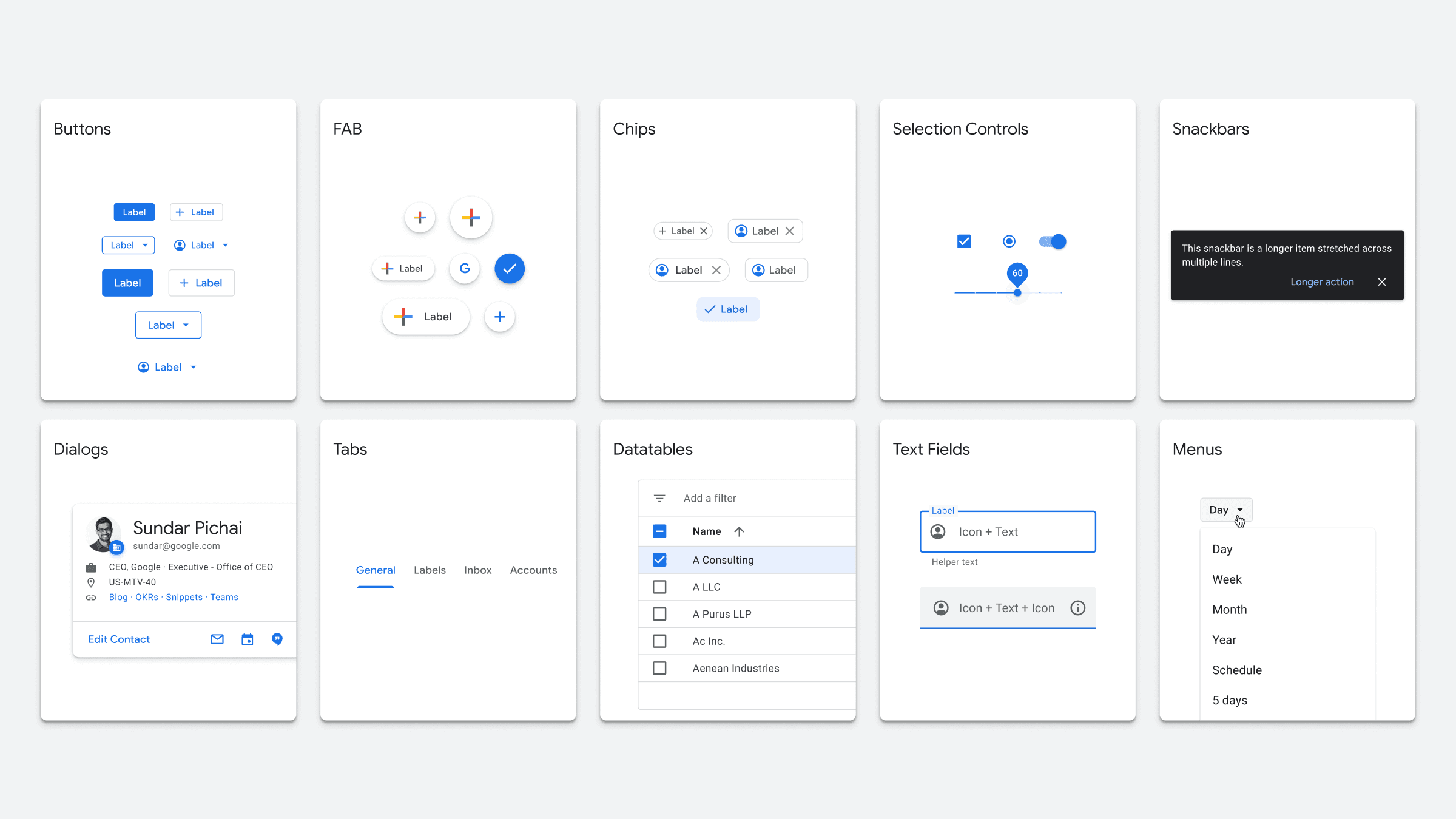
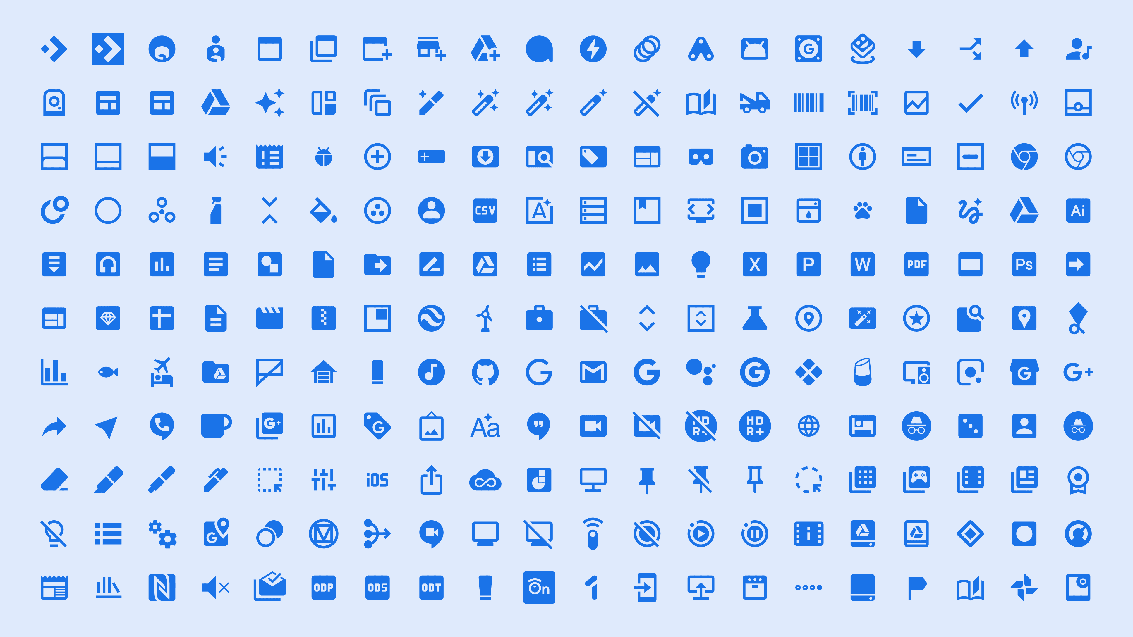
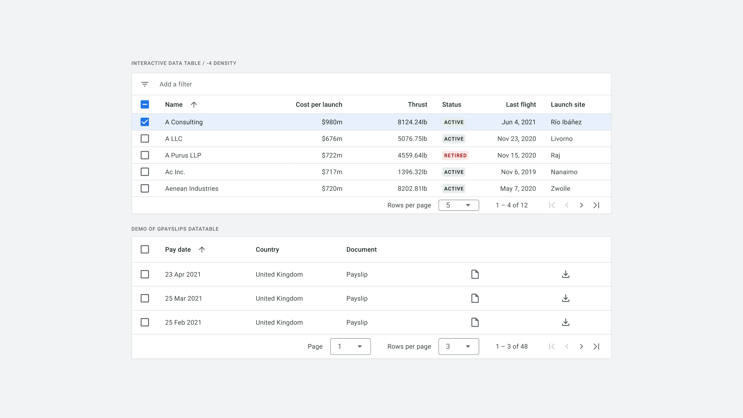
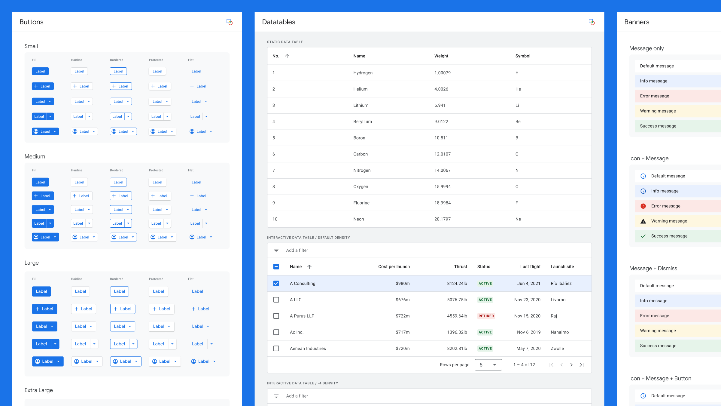
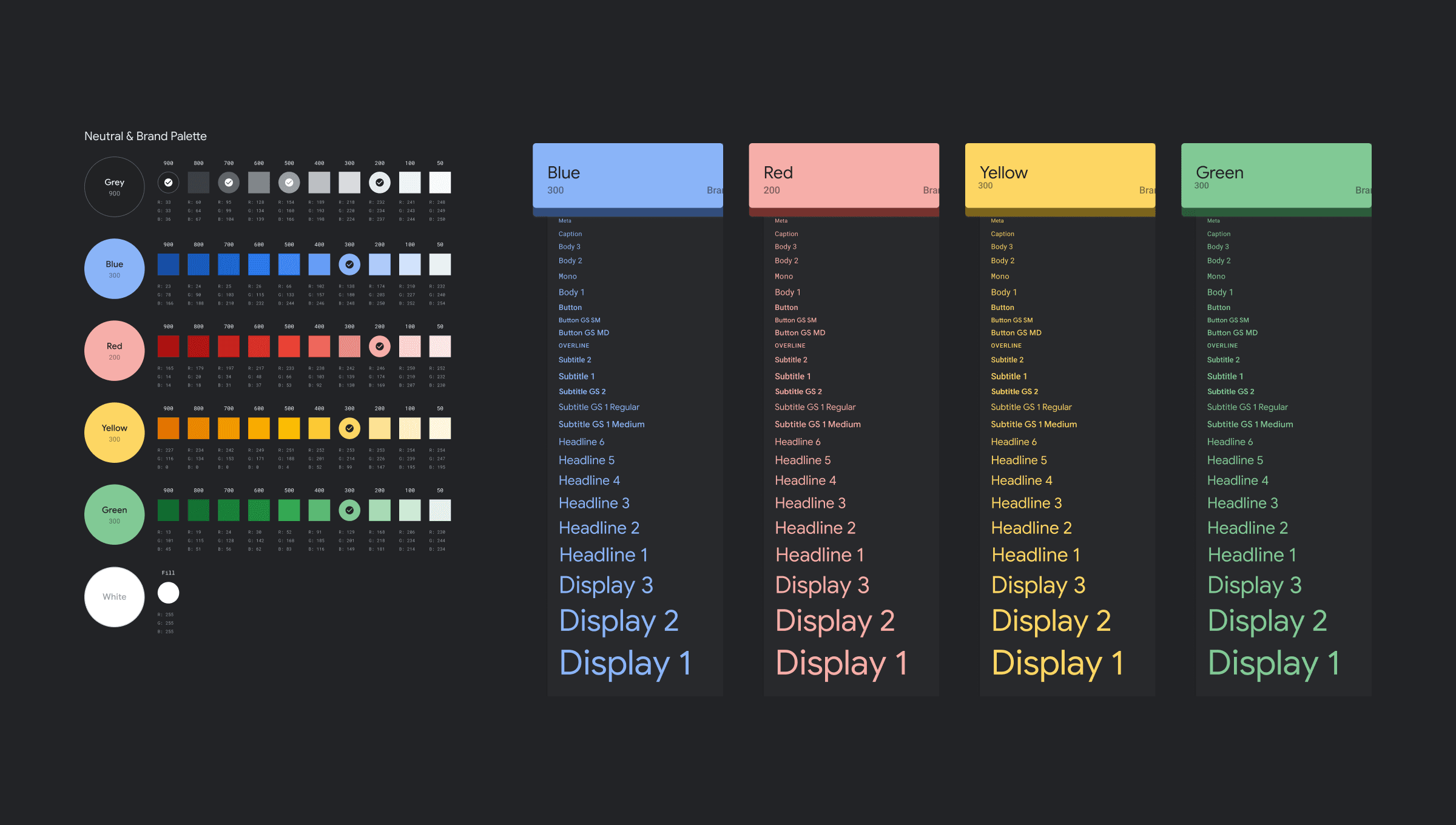
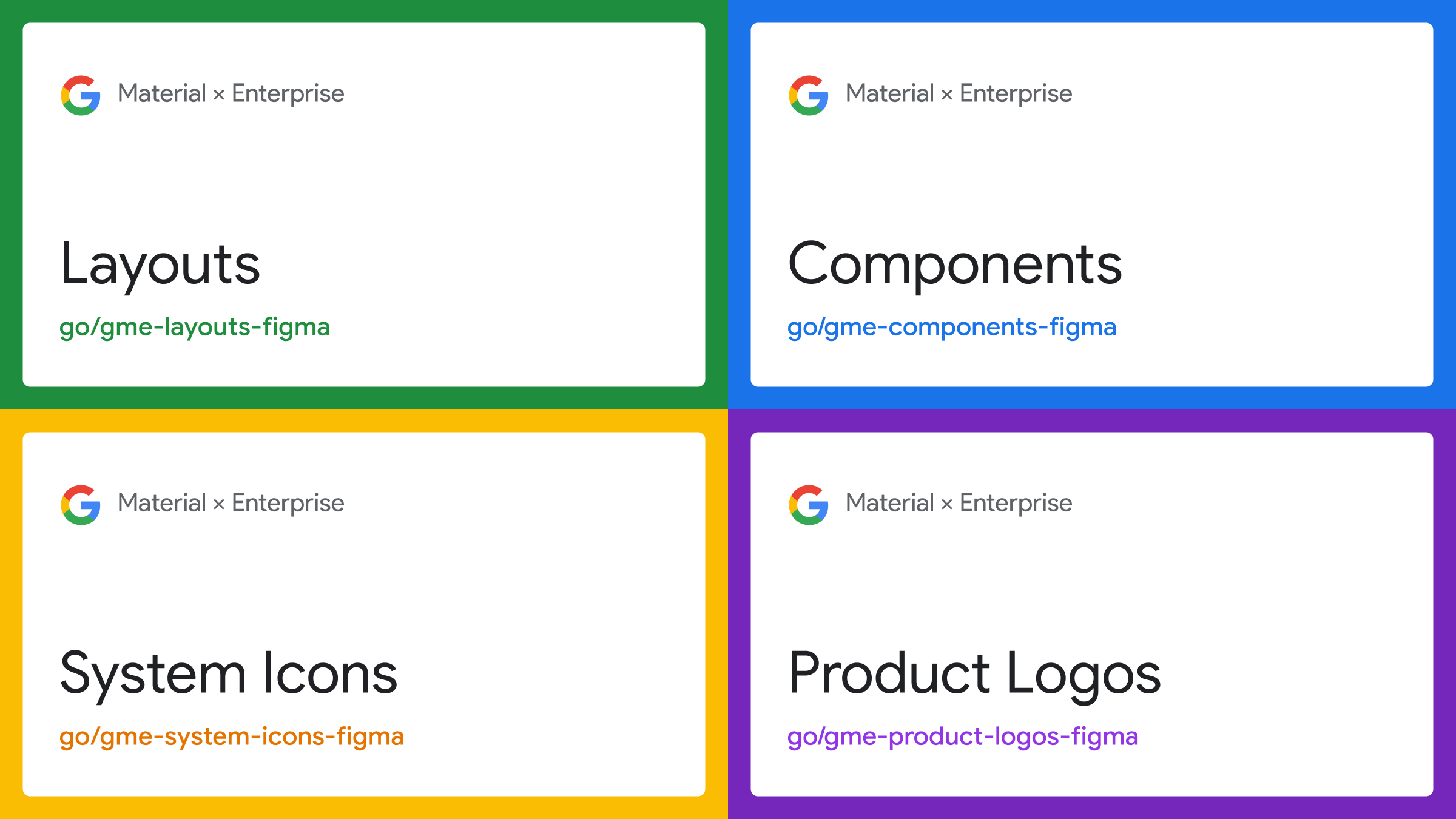
Talking with other teams, I found several trying to solve the same problem with migrating their enterprise designs to Google Material. To reduce redundancy and improve efficiency, I formed and led a cross-functional team of UX designers, developers, and product managers from Ads, Cloud, and Material Design. Our objective was to create a consolidated library, called Google Material x Enterprise (GME), as an extension to the Material Design System that specifically caters to enterprise products.
GME Library Results
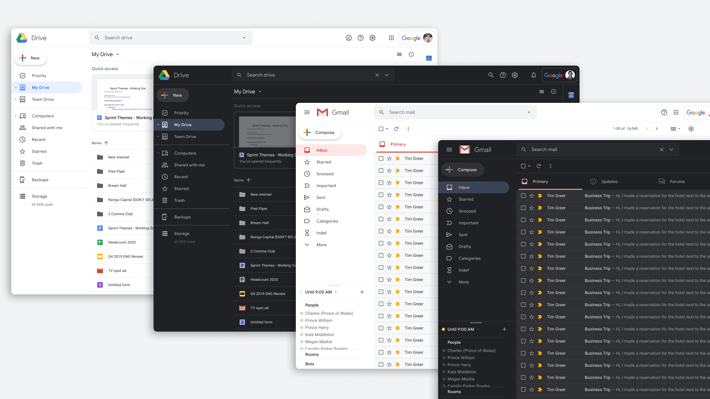
GME shipped in Sketch in Q4 2018 and in Figma in late 2019.
It helped designers across Cloud, Workspace, Ads, and Analytics transition their product UIs to Google Material. It also introduced the first version of dark mode, one of the most requested design updates from GCP developers. The Material team later refined those early concepts into the standard used today.
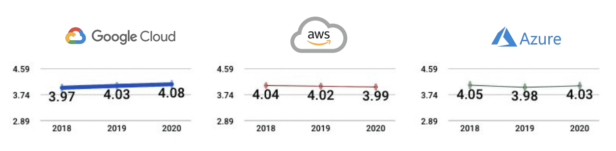
By the end of 2020, GME and other console improvements helped to raise the GCP console ratings from 3.97 to 4.08 over three years, in customer satisfaction and vendor review scores. Ratings also compared favorably with other leading cloud platforms, such as AWS and Azure.
Landing Page Experience (LPX)
GCP Home Dashboard redesign
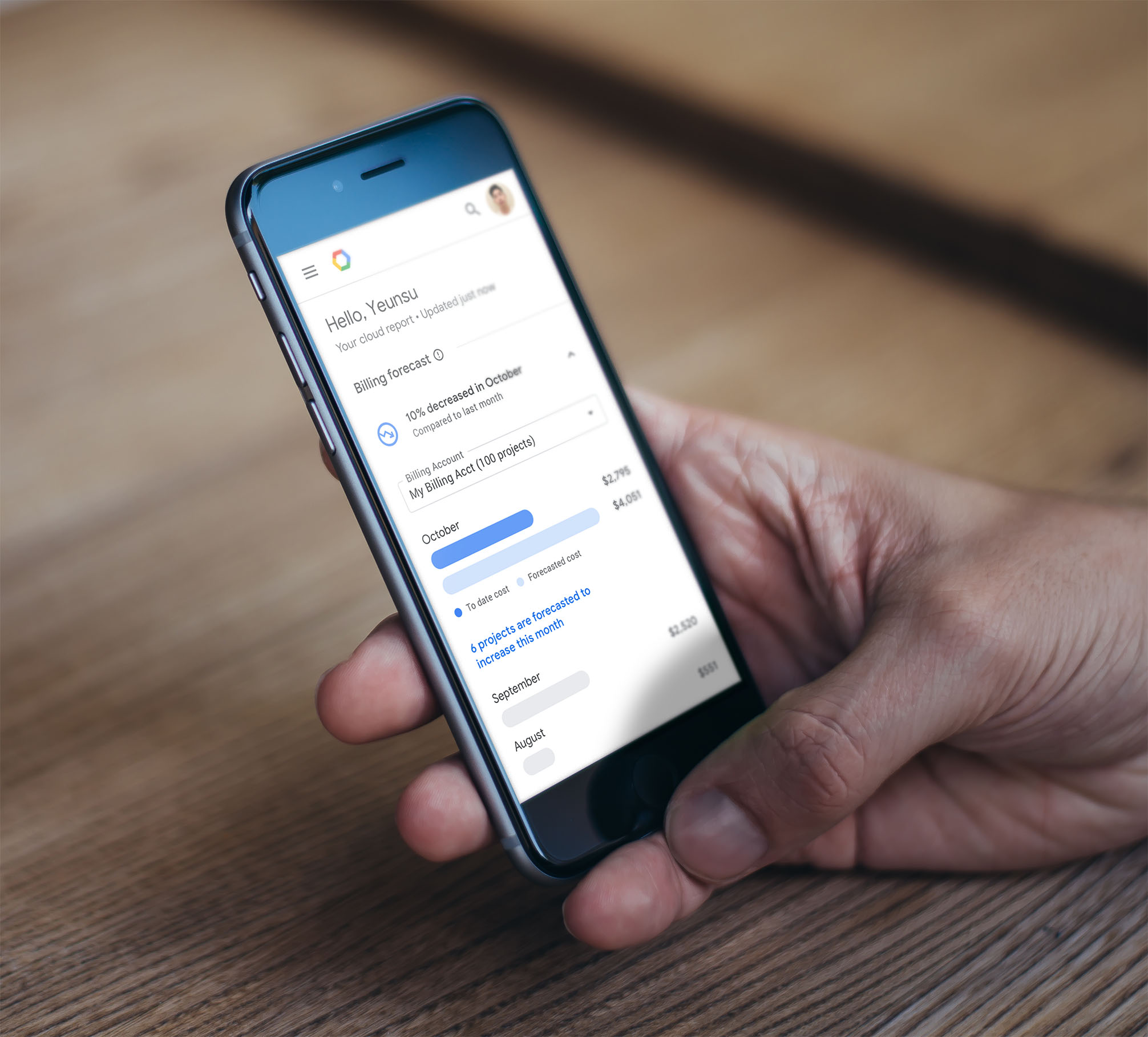
The Google Cloud Platform’s landing page experience (LPX) started PNext, a multi-year redesign of the GCP Console. PNext was part of a Google-wide mandate to move every app from Material Design (M2) to Google Material (GM3), for a consistent, coherent Google brand. It was one of the first opportunities to test and validate GME UI components.
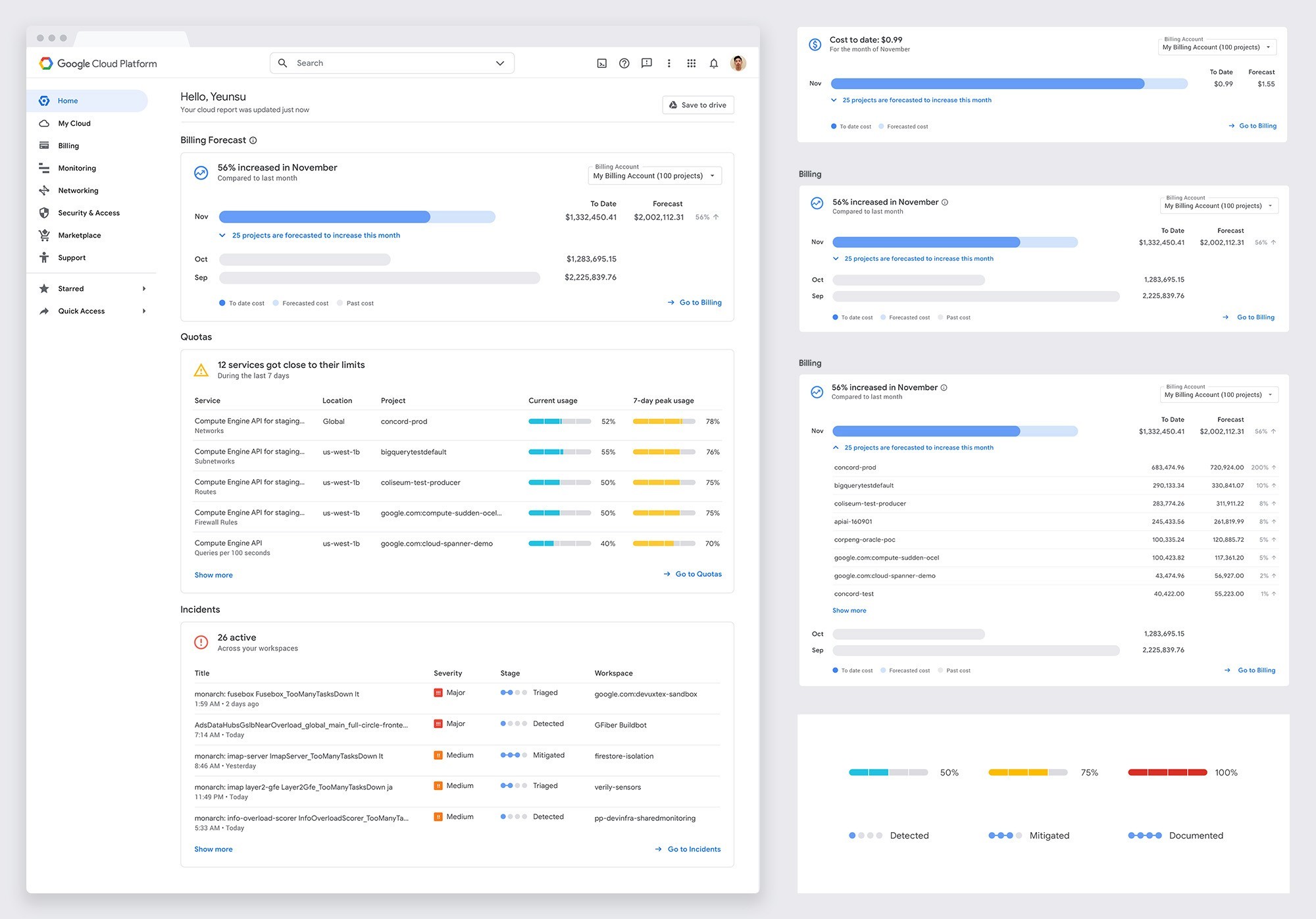
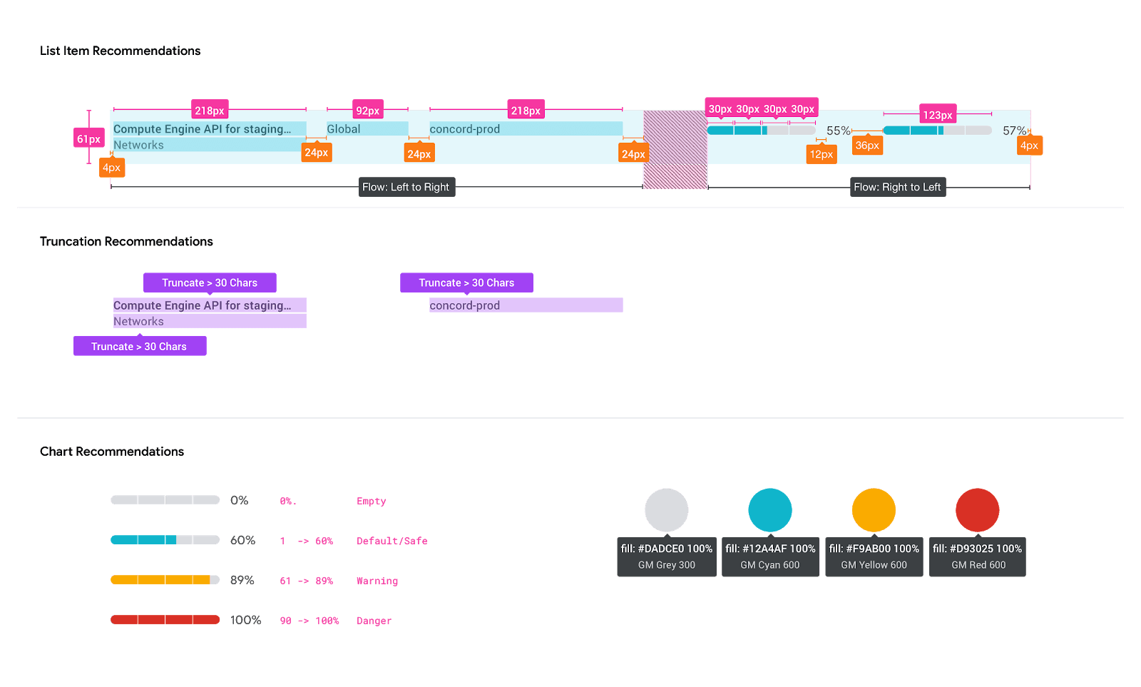
LPX displays vital information about the customer's Cloud ecosystem, including issues, insights, and recommendations. Data visualization charts communicate new design principles: accuracy, helpfulness, and scalability.
Our content strategy prioritized simple signposts, compelling data visualizations, and clear top-level roll-ups
I provided creative direction for the visual design team and partnered with UX, Research, Product, and Engineering to produce the page.
LPX Results
The team launched the dashboard without the updated PNext navigation as an early access program for our top 100 customers in the Spring of 2019.
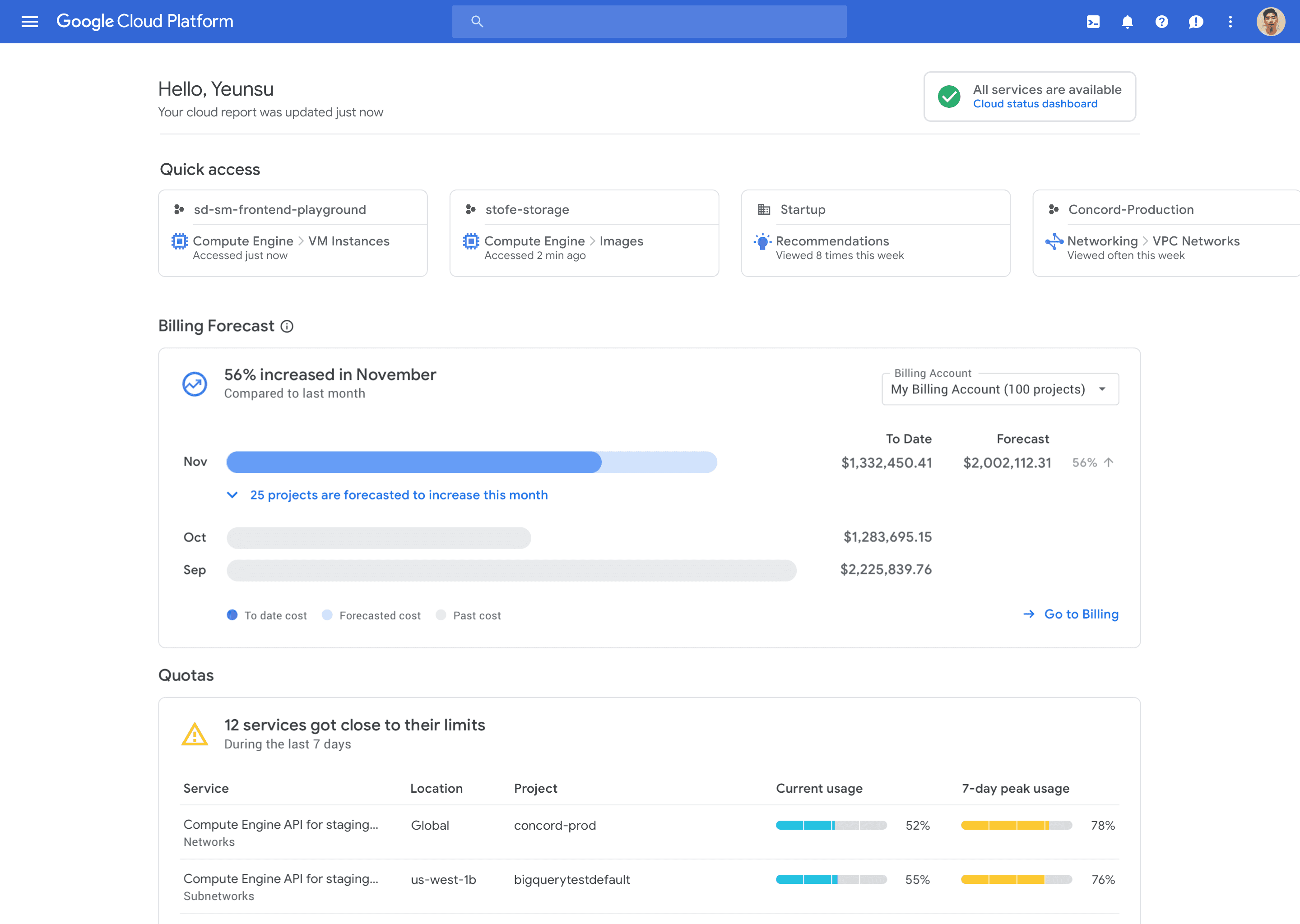
We conducted a preview where we measured engagement and user satisfaction using analytics, an in-page feedback module, and surveys. During the preview, Etsy, and Ikea, among other customers, praised the new design and layout, appreciating the focus on simplicity. However, despite the positive design feedback, LPX never became generally available because data retrieval took too much time, leaving users unsatisfied with the performance.
What I learned: some customers ran so many resources (compute, databases, containers, AI/ML) that processing and estimating them was beyond what our ML could do at the time. We should have pushed engineering to test and validate those limits sooner, before we went too far.
“
The colors, the design, I love it…It's becoming more Google.”
Product Manager
Etsy
“
It's moving toward simplicity and I appreciate it.”
Engineering Manager
Ikea
Contributions
Product design direction, content Strategy, visual Design
Collaborators
GME: Bethany Fong (UX Design, Material partner), Darren Head (UI Design), Jeff Weber (UI Design, Workspace partner), Piper Vornholt (UX Research), Shuo Yang (UX Design), Sterling White (UI Design, Ads team partner)
LPX: Christina Taggart (UX Design), Cody Bratt (Product), Ray Shin (UI Design), Tanvir Hassan (Technical Lead), Tim Hetland (Content Strategy), Warren Wang (Software Engineer), Yoanna Dosouto (UX Research)

Google Material for Enterprise
Role: Creative Lead
Overview
Material Design, the most popular design system in the world, was first developed for creating Android apps. The goal was to have a design system that was intuitive to use and uniform across every device. Google eventually used Material design to rebuild all of its apps to make them more user-friendly and intuitive. The first version of Material used at Google was called Kennedy.
However, Google soon realized that users couldn't distinguish Google-branded apps from others (e.g., Gmail looked the same as Outlook). Google Material was created as a Google branded Material design theme that enables teams to build beautiful, usable products that are distinguished from third-party applications.
Problem
In 2018, the Material Design team had a goal to style all first-party applications with Google Material (GM3).
However, this was not an easy task as enterprise products like Cloud Platform and Ads posed a challenge due to their complex ecosystems and high-density layouts. These products utilize carefully designed compact UI components, which made it difficult for the team to meet their objective.
The Material team didn’t have the budget or people to build enterprise components itself.
Solution
In late 2017, Google recruited and hired me to lead the newly formed visual design team for Google Cloud. I managed three designers and set the visual design direction for the GCP Platform Design team. Our main surface was the Cloud Console, the primary web interface for most Google Cloud users.
My principal responsibility was to collaborate with the GCP Platform UX team and migrate our UI components, patterns, and styles to conform with Google Material.
Talking with other teams, I found several designers trying to solve the same problem with migrating their enterprise designs to Google Material. To reduce redundancy and improve efficiency, I formed and led a cross-functional team of UX designers, developers, and product managers from Ads, Cloud, and Material Design. Our objective was to create a consolidated library, called Google Material x Enterprise (GME), as an extension to the Google Material Design System that specifically caters to enterprise products.
GME Library Results
GME shipped in Sketch in Q4 2018 and in Figma in late 2019.
It helped designers across Cloud, Workspace, Ads, and Analytics transition their product UIs to Google Material. It also introduced the first version of dark mode, one of the most requested design updates from GCP developers. The Material team later refined those early concepts into the standard used today.
By the end of 2020, GME and other console improvements helped to raise the GCP console ratings from 3.97 to 4.08 over three years, in customer satisfaction and vendor review scores. Ratings also compared favorably with other leading cloud platforms, such as AWS and Azure.
Landing Page Experience (LPX)
GCP Home Dashboard redesign
The Google Cloud Platform’s landing page experience (LPX) started PNext, a multi-year redesign of the GCP Console. PNext was part of the Google-wide mandate to move every app from Material Design (M2) to Google Material (GM3), for a consistent, coherent Google brand. It was one of the first opportunities to test and validate GME UI components.
LPX displays vital information about the customer's Cloud ecosystem, including issues, insights, and recommendations. Data visualization charts communicate new design principles: accuracy, helpfulness, and scalability.
Our content strategy prioritized simple signposts, compelling data visualizations, and clear top-level roll-ups
I provided creative direction for the visual design team and partnered with UX, Research, Product, and Engineering to produce the page.
LPX Results
The team launched the dashboard without the updated PNext navigation as an early access program for our top 100 customers in the Spring of 2019.
We conducted a preview where we measured engagement and user satisfaction using analytics, an in-page feedback module, and surveys. During the preview, Etsy, and Ikea, among other customers, praised the new design and layout, appreciating the focus on simplicity. However, despite the positive design feedback, LPX never became generally available because data retrieval took too much time, leaving users unsatisfied with the performance.
What I learned: some customers ran so many resources (compute, databases, containers, AI/ML) that processing and estimating them was beyond what our ML could do at the time. We should have pushed engineering to test and validate those limits sooner, before we went too far.
“
The colors, the design, I love it…It's becoming more Google.”
Product Manager
Etsy
“
It's moving toward simplicity and I appreciate it.”
Engineering Manager
Ikea
Contributions
Product design direction, content Strategy, visual Design
Collaborators
GME: Bethany Fong (UX Design, Material partner), Darren Head (UI Design), Jeff Weber (UI Design, Workspace partner), Piper Vornholt (UX Research), Shuo Yang (UX Design), Sterling White (UI Design, Ads team partner)
LPX: Christina Taggart (UX Design), Cody Bratt (Product), Ray Shin (UI Design), Tanvir Hassan (Technical Lead), Tim Hetland (Content Strategy), Warren Wang (Software Engineer), Yoanna Dosouto (UX Research)

Google Material for Enterprise
Role: Creative Lead
Overview
Material Design, the most popular design system in the world, was first developed for creating Android apps. The goal was to have a design system that was intuitive to use and uniform across every device. Google eventually used Material design to rebuild all of its apps to make them more user-friendly and intuitive. The first version of Material used at Google was called Kennedy.
However, Google soon realized that users couldn't distinguish Google-branded apps from others (e.g., Gmail looked the same as Outlook). Google Material was created as a Google branded Material design theme that enables teams to build beautiful, usable products that are distinguished from third-party applications.
Problem
In 2018, the Material Design team had a goal to style all first-party applications with Google Material (GM3).
However, this was not an easy task as enterprise products like Cloud Platform and Ads posed a challenge due to their complex ecosystems and high-density layouts. These products utilize carefully designed compact UI components, which made it difficult for the team to meet their objective.
The Material team didn’t have the budget or people to build enterprise components itself.
Solution
In late 2017, Google recruited and hired me to lead the newly formed visual design team for Google Cloud. I managed three designers and set the visual design direction for the GCP Platform Design team. Our main surface was the Cloud Console, the primary web interface for most Google Cloud users.
My principal responsibility was to collaborate with the GCP Platform UX team and migrate our UI components, patterns, and styles to conform with Google Material.
Talking with other teams, I found several designers trying to solve the same problem with migrating their enterprise designs to Google Material. To reduce redundancy and improve efficiency, I formed and led a cross-functional team of UX designers, developers, and product managers from Ads, Cloud, and Material Design. Our objective was to create a consolidated library, called Google Material x Enterprise (GME), as an extension to the Google Material Design System that specifically caters to enterprise products.
GME Library Results
GME shipped in Sketch in Q4 2018 and in Figma in late 2019.
It helped designers across Cloud, Workspace, Ads, and Analytics transition their product UIs to Google Material. It also introduced the first version of dark mode, one of the most requested design updates from GCP developers. The Material team later refined those early concepts into the standard used today.
By the end of 2020, GME and other console improvements helped to raise the GCP console ratings from 3.97 to 4.08 over three years, in customer satisfaction and vendor review scores. Ratings also compared favorably with other leading cloud platforms, such as AWS and Azure.
Landing Page Experience (LPX)
GCP Home Dashboard redesign
The Google Cloud Platform’s landing page experience (LPX) started PNext, a multi-year redesign of the GCP Console. PNext was part of the Google-wide mandate to move every app from Material Design (M2) to Google Material (GM3), for a consistent, coherent Google brand. It was one of the first opportunities to test and validate GME UI components.
LPX displays vital information about the customer's Cloud ecosystem, including issues, insights, and recommendations. Data visualization charts communicate new design principles: accuracy, helpfulness, and scalability.
Our content strategy prioritized simple signposts, compelling data visualizations, and clear top-level roll-ups
I provided creative direction for the visual design team and partnered with UX, Research, Product, and Engineering to produce the page.
LPX Results
The team launched the dashboard without the updated PNext navigation as an early access program for our top 100 customers in the Spring of 2019.
We conducted a preview where we measured engagement and user satisfaction using analytics, an in-page feedback module, and surveys. During the preview, Etsy, and Ikea, among other customers, praised the new design and layout, appreciating the focus on simplicity. However, despite the positive design feedback, LPX never became generally available because data retrieval took too much time, leaving users unsatisfied with the performance.
What I learned: some customers ran so many resources (compute, databases, containers, AI/ML) that processing and estimating them was beyond what our ML could do at the time. We should have pushed engineering to test and validate those limits sooner, before we went too far.
“
The colors, the design, I love it…It's becoming more Google.”
Product Manager
Etsy
“
It's moving toward simplicity and I appreciate it.”
Engineering Manager
Ikea
Contributions
Product design direction, content Strategy, visual Design
Collaborators
GME: Bethany Fong (UX Design, Material partner), Darren Head (UI Design), Jeff Weber (UI Design, Workspace partner), Piper Vornholt (UX Research), Shuo Yang (UX Design), Sterling White (UI Design, Ads team partner)
LPX: Christina Taggart (UX Design), Cody Bratt (Product), Ray Shin (UI Design), Tanvir Hassan (Technical Lead), Tim Hetland (Content Strategy), Warren Wang (Software Engineer), Yoanna Dosouto (UX Research)